Find a Good Place
A side project that scores and compares UK areas on what you care about — and what I learned shipping it end to end.
When we were trying to decide where to move, I ended up with about a dozen browser tabs open. One for crime stats. One for the flood map. One for Ofsted ratings. One for Street View, dragging the little person up and down a road to see whether it felt nice. And no way to actually line two areas up next to each other and say: which of these is better, for us.
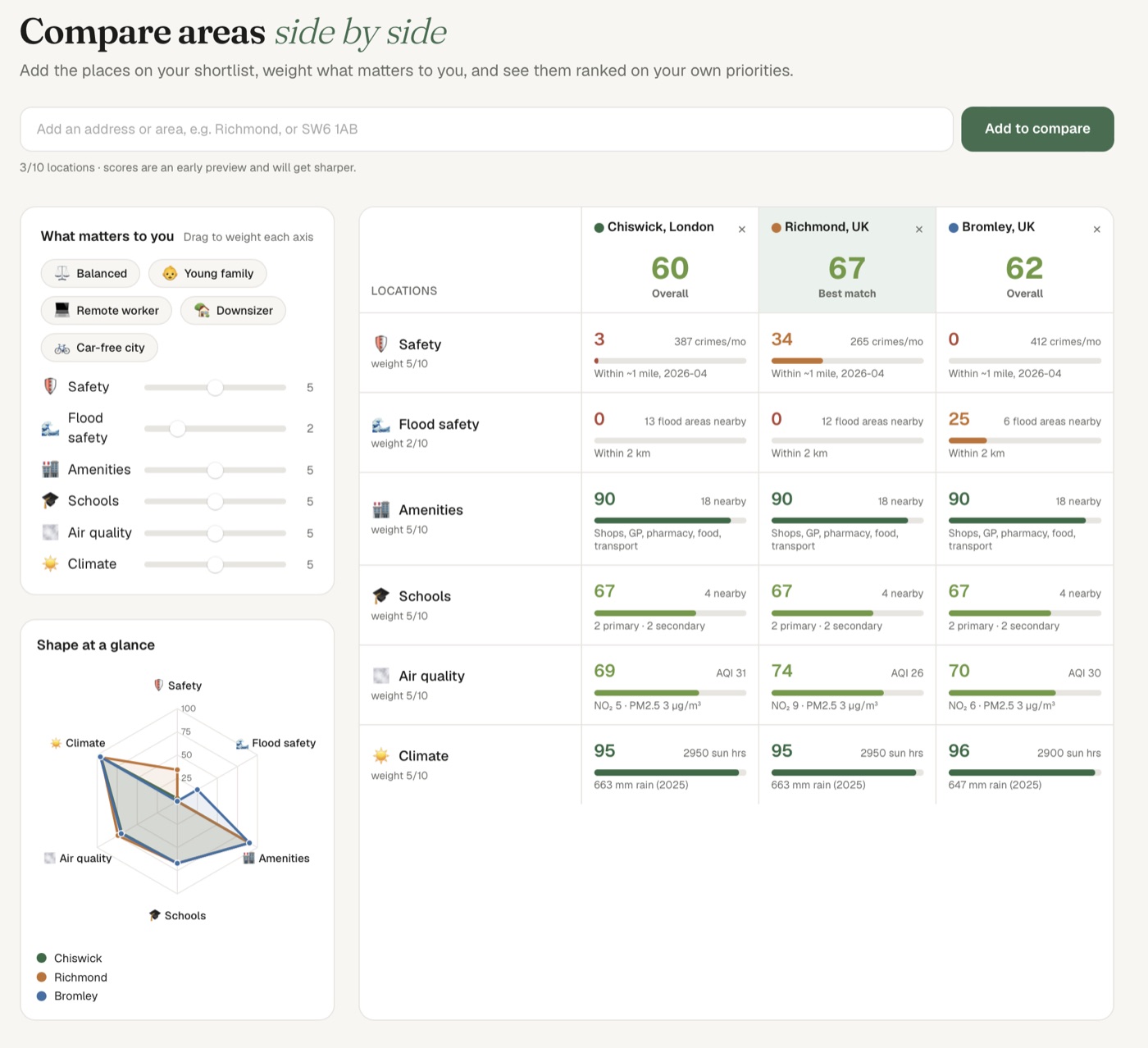
So I built Find a Good Place. It gives any UK area a score out of a hundred, across the things people actually weigh up when they move — safety, schools, flood risk, air quality, amenities, climate — and it lets you compare a shortlist side by side, the way you'd compare phones.
The problem with how we pick where to live
The data already exists. The police publish street-level crime. The Environment Agency publishes flood-risk areas. The DfE publishes school performance. DEFRA publishes air quality. It's all there, all free, all public. The problem is that it lives in a dozen different places, in a dozen different formats, and none of it is comparable. "How many crimes per month" and "what flood band" and "what Ofsted rating" don't add up to anything on their own.
What you want, when you're deciding between two places, is one number per thing, on the same scale, that you can read at a glance and weigh against each other. That's the whole idea. Take the messy public data, normalise every measure onto a 0–100 scale where higher is better, and let you decide how much each one matters to you.
What it actually does
You type an address or an area. It scores it, instantly, on each dimension. Then you drag sliders to say what you care about — a young family weights schools and safety; a remote worker weights climate and broadband; someone car-free weights amenities and transport — and the overall score recalculates live. Add a second area, and a third, and they line up in a table, ranked on your priorities, not some generic average.
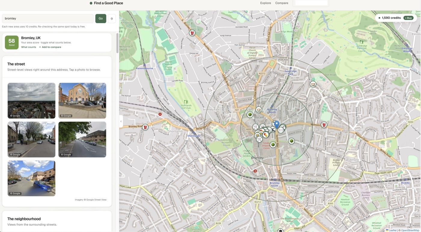
And when you want the on-the-ground feel rather than the numbers, there's the explore view — street-level photos around the address, plus a map of the nearest schools, shops, GP, parks and transport. The bit you used to get by dragging the Street View person around for half an hour, gathered in one place.
How it's built
It's a Next.js app on Vercel, which is a long way from the coin-sized chips I usually write about here — but the part I'm happiest with is the same instinct that makes embedded code nice: keep the pieces small and pluggable. Each scoring dimension is one module behind a common interface. It fetches its data, normalises to 0–100, and returns. Adding a new dimension — air quality, say — was a single file and one line in a registry. The score engine doesn't know or care how many dimensions there are.
The interesting constraints were legal, not technical. Google's Maps terms don't let you cache their imagery, so every Street View photo is fetched live and shown with attribution, never stored. And a score that passes public judgement on a specific house is a defamation problem, so everything stays at area level. Most of the actual data comes from free UK government sources, which is lovely: no rate limits, no per-call cost, and nobody can switch it off.
What I learned shipping it
Writing the app was the smaller half. Everything around it — a domain, email that actually delivers, real payments, restricting the API keys so a leak can't drain your bank account, a privacy policy, a support page — was most of the work, and none of it is the fun part. It's also the part that decides whether a side project is a real thing or a demo.
The part I keep coming back to is that the interesting bit isn't any single screen — it's the layer underneath. Fusing a dozen messy, incompatible data sources into one coherent, comparable score takes a lot of unglamorous decisions: how you normalise each measure, how you handle missing data, what "good" even means for an axis. And it gets better the more people use it, because what they choose to weight tells you what movers actually value. That accumulated, opinionated layer is the part that compounds — and it's the part I'm most interested in sharpening.
It's live now at findagoodplace.co.uk. The first few areas are free, so you can run a real comparison before deciding whether it's worth anything to you. If you're mid-move, try lining up the places you're torn between — and if a score feels wrong, tell me. That's exactly the feedback that makes the next version sharper.